User Flows for Dummies
How to create complex but not complicated products

They gained exactly 37k users a day for 30 days straight. Does he think I’m that gullible? I know he faked all these users. My VC friend ranted about a startup founder we’ve both crossed paths with in San Francisco. The concept sounded compelling, but had the world’s worst execution. Their onboarding took an excruciating ten minutes and the checkout was far from the seamless one-click experience of Amazon. Needless to say, the company met a swift demise.
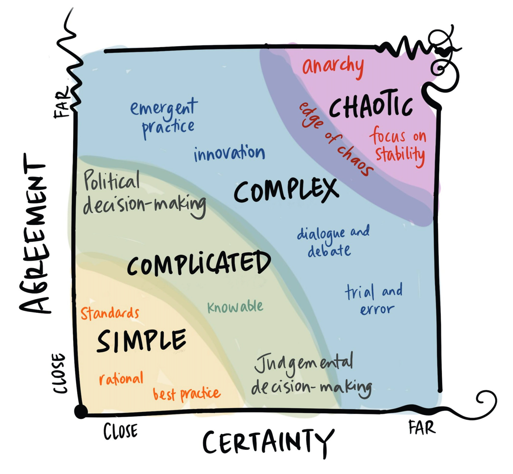
Complex vs. Complicated
In today’s attention economy, capturing real eyeballs (and avoiding the need to fake users…) requires simple experience design. Companies are inherently complex, but they need not be complicated. Complex products allow for emergent behaviors unbeknownst to their creators, while complicated ones struggle with UI-creep and messaging flaws. So why does one successful product beat another failed product, while both have virtually the same features? Because while both were complex, one avoided attrition with simple user flows.
Tangible Steps to Build Winning User Flows
Let’s not be those product people who just talk in circles — no one likes a hand-waver. We’ll walk through an onboarding user flow I made recently as an example.
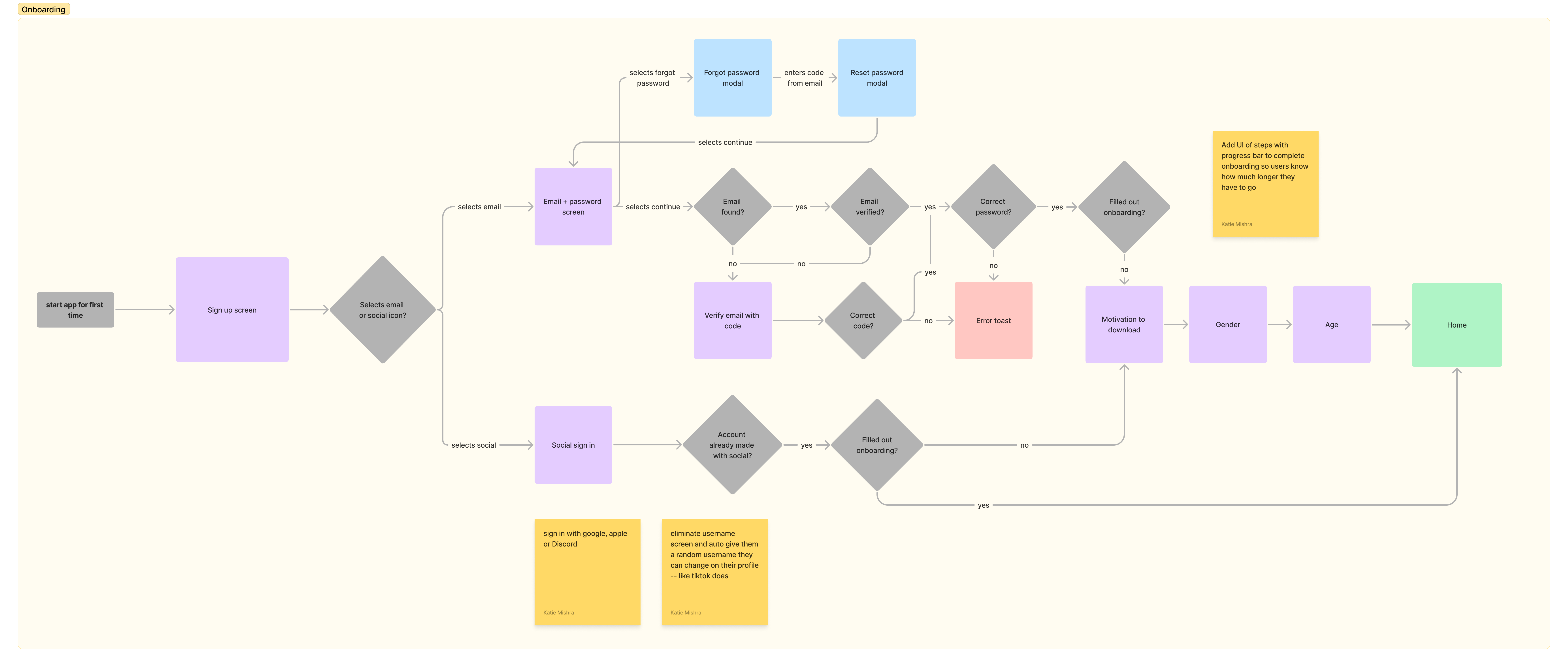
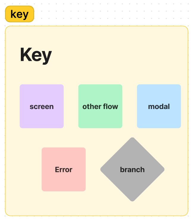
Structure: Figma Templates
Kickstart your design process with Figma community templates — from traditional user flows with action/decision paths to low-fi screen connections. Customize your structure to match your personal or team frameworks. Each flow should start with an entry point and map to a new flow. I keep my structure simple, represented by a colorful key for each node type.
Terminology: Speak the Same Language
But it’s the same thing, just different words — who cares? You should, that’s who. Avoid the pitfall of misinterpreting concepts due to language discrepancies. Stick to aligned terminology to boost team efficiency and streamline the product-design-dev communication cycle. It's the little things that count—like using "selects" instead of "presses" or "taps" to describe a user's action.
Visual Delight: Treat Screens Like Presentations
Creating visual slides with limited text is the presentation class mantra, and holds true for UX as well. Users should grasp a screen's functionality at a glance. Take Duolingo’s onboarding survey as an example:
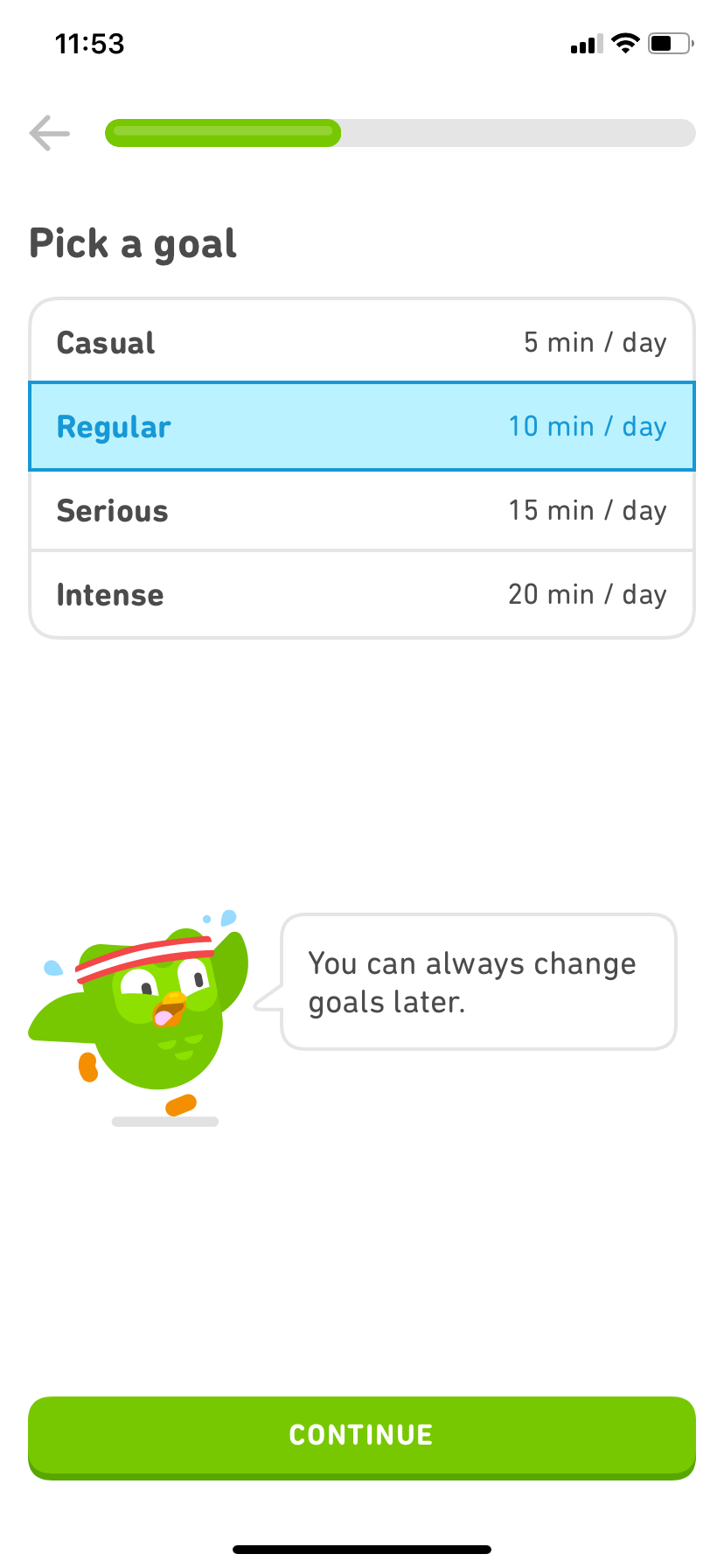
They could have put each question in their onboarding on a single screen, thereby minimizing clicks, the famed goal of UX. But that would clutter the screen, leaving too much text and overwhelmed users. They opted for direct instructions to inform users’ next action, at the cost of additional screens.
Flaws vs. Flawless Competitive Research
Pick 3-5 products that mirror yours across user personas, motivations, and engagement behaviors. You don’t have to build user flows in the dark; build upon work from those who came before you. For example, I’ve borrowed some gems from Duolingo to drive retention in products.
Examine your chosen products meticulously, noting both their flaws and what impresses you. Create a spreadsheet for comprehensive analysis, and use ChatGPT to identify similarities amongst the product lists. You’ll unlock efficient learnings about your competitors' ingenuity while avoiding their pitfalls.
Use Clear Copy
Avoid an amorphous brand—clearly convey what your product does in your app copy, product names, and marketing materials. Until you achieve product-market fit, make sure users know exactly what they're getting. Don't let a great user experience go unnoticed just because of vague messaging.
Notes Galore
Sticky notes are back in vogue; they're a powerful tool for explaining your thinking and clarifying user flows to your developers. Never assume that your team can read your mind—be explicit and thorough.
Don’t be the founder who fakes your users. Instead, give them a genuine reason to join and offer a seamless experience. This way, you won’t tarnish your reputation with VCs and may actually build that unicorn startup.
-Katie